Lynn Byrd, Greg Byrd and, Chris Pearce Solutions for Chapter: Interpreting Results, Exercise 4: Exercise 16.3
Lynn Byrd Mathematics Solutions for Exercise - Lynn Byrd, Greg Byrd and, Chris Pearce Solutions for Chapter: Interpreting Results, Exercise 4: Exercise 16.3
Attempt the practice questions on Chapter 16: Interpreting Results, Exercise 4: Exercise 16.3 with hints and solutions to strengthen your understanding. Cambridge Lower Secondary Mathematics Learner's Book 7 Second Edition Digital Access solutions are prepared by Experienced Embibe Experts.
Questions from Lynn Byrd, Greg Byrd and, Chris Pearce Solutions for Chapter: Interpreting Results, Exercise 4: Exercise 16.3 with Hints & Solutions
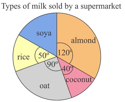
A supermarket sells five types of milk made from plants. The pie chart shows the proportion of different plant milks the supermarket sold in one day.

What percentage of different plant milks sold was oat?
A supermarket sells five types of milk made from plants. The pie chart shows the proportion of different plant milks the supermarket sold in one day.

Altogether, the supermarket sold on this day. How many litres of soya milk was sold on this day?
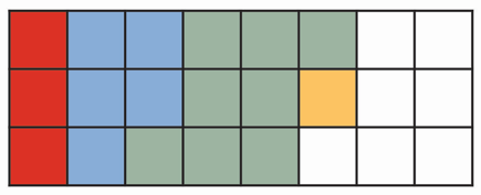
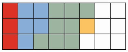
The waffle diagram shows the colours of the cars in a school's staff car park.

Use the waffle diagram to complete the following table.
| Colour of car | Number of cars |
| Red | |
| Blue | |
| Green | |
| Yellow | |
| White |
The waffle diagram shows the colours of the cars in a school's staff car park.

Draw a pie chart to show the information given in the waffle diagram.
The waffle diagram shows the number of hot drinks sold in a cafe on a day.

Use the diagram to complete the table.
| Hot drink | Number of drinks | Percentage of total | Number of degree |
| Tea | of | ||
| Coffee | |||
| Hot Chocolate | |||
| Total |
The waffle diagram shows the number of hot drinks sold in a cafe on a day.

Use the diagram to complete the table.
| Hot drink | Number of drinks | Percentage of total | Number of degree |
| Tea | of | ||
| Coffee | |||
| Hot Chocolate | |||
| Total |
Sofia says instead of working out the percentages and then the degrees, I think it is easier to work out the degree straight away like this, tea .
Do you agree with Sofia or would work the percentages and then the degrees? Explain why.
The waffle diagram shows the number of hot drinks sold in a cafe on a day.

Draw a pie chart to show the information given in the waffle diagram.
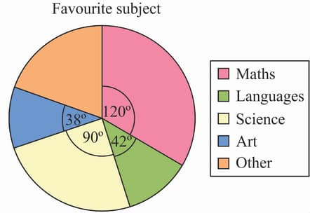
The pie chart shows the results of survey of students' favourite subject. students chose Maths. Show that students chose 'others'.

