Embibe Experts Solutions for Chapter: Data Interpretation, Exercise 6: Radar Graphs
Embibe Experts Aptitude Solutions for Exercise - Embibe Experts Solutions for Chapter: Data Interpretation, Exercise 6: Radar Graphs
Attempt the practice questions on Chapter 1: Data Interpretation, Exercise 6: Radar Graphs with hints and solutions to strengthen your understanding. Practice book for English and Aptitude for VITEEE solutions are prepared by Experienced Embibe Experts.
Questions from Embibe Experts Solutions for Chapter: Data Interpretation, Exercise 6: Radar Graphs with Hints & Solutions
Study the radar graph carefully and answer the question that follows:
The graph represents number of students (in thousands) in two different universities in six different years.

In which year was the difference between the number of students in university-1 and the number of students in university-2 highest ?
The radar graph given below shows the production of steel by three companies (in million tonnes) from 2010 to 2015. Study the graph and answer the following question.
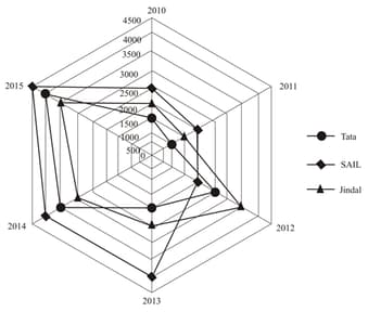
What is the total production of steel (million tonnes) in 2011, 2012 and 2013 together?
Study the radar graph carefully and answer the questions that follows:
The graph represents number of students (in thousands) in two different universities in six different years.
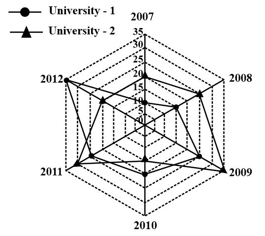
What was the difference between the number of students in university 1 in the year 2010 and the number of students in university 2 in the year 2012?
The radar graph given below shows the sales (by units) of three models of two-wheelers by a company. Models of two-wheelers sold by the company are Activa, Kawasaki, and Enfield. Study the following graph and answer the following question.
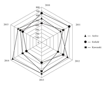
For which year is the percentage increase in sales of Kawasaki the maximum?
Study the radar graph carefully and answer the question that follows:
The graph represents number of students (in thousands) in two different universities in six different years.

What was the percent increase in the number of students in university in the year as compared to the previous year?
Study the radar graph carefully and answer the question that follows:
The graph represents number of students (in thousands) in two different universities in six different years.

If 25% of the students in university 2 in the year 2010 were females, what was the number of male students in the university 2 in the same year?
The radar graph given below shows the sales (by units) of three models of two-wheelers by a company. Models of two-wheelers sold by the company are Activa, Kawasaki, and Enfield. Study the graph and answer the following question.
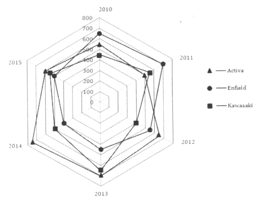
What is the ratio of sales of Enfield in 2015 to the sales of Kawasaki in 2013?
The radar graph given below shows the production of steel by three companies (in million tonnes) from 2010 to 2015. Study the graph and answer the following question.
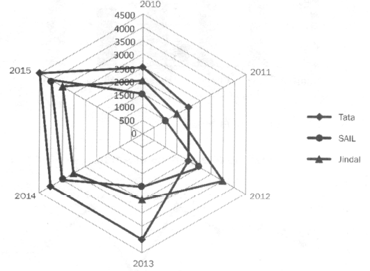
By what percentage is the production in the year 2010 less than in the year 2015?
