
A is a zig-zag line that is usually drawn in the axis when the scale on the axis does not start from zero.
Important Questions on Representation of Data
The given histogram shows the frequency distribution of the speed of cars passing through a particular spot on a highway. Read the graph and answer the following question.
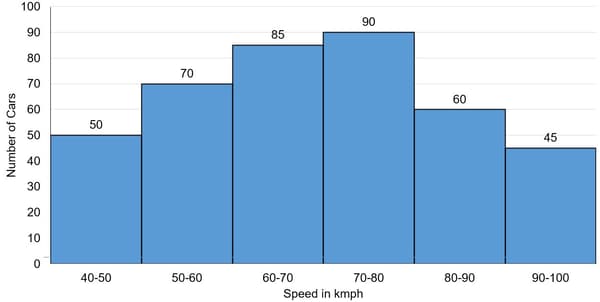
What percentage of cars were running with the speed of and above?
Study the given histogram that shows the marks obtained by students in an examination and answer the question that follows,
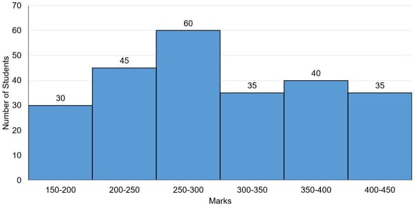
The number of students who obtained less than marks is:
The given histogram shows the frequency distribution of the speed of cars passing through a particular spot on a highway. Read the graph and answer the following question.

What is the ratio of the number of cars with speed less than to the number of cars with speed more than ?
Using graph paper, draw a histogram for the given distribution showing the number of runs scored by batsmen. Estimate the mode of the data:
| Runs Scored | |||||||
| No. of batsmen |
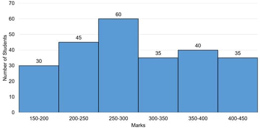
The given graph shows the marks obtained by the students in an examination.

The numbers of students who obtained less than marks is what percent more than the number of students who obtained or more marks?
Draw a histogram for the given data using a graph paper:
| Weekly Wages(in ) | Number of people |
Estimate the mode from the graph.
The given histogram shows the frequency distribution of the speed of cars passing through at a particular spot on a highway. Study the graph and answer the questions that follows:
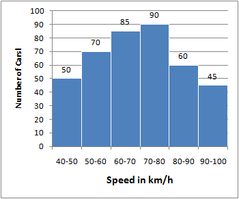
What percentage of cars were running with a speed of less than ?
The following histogram represents the distribution of household expenditure (in ) of manual workers in a city.
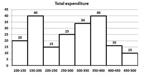
The ratio of the number of workers whose household expenditure is less than to the number of workers whose household expenditure is less than is _____.
Study the graph and answer the question,
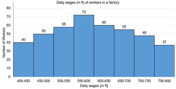
The number of workers in the factory whose daily wages are or more but less than is:
Study the given histogram that shows the marks obtained by students in an examination and answer the question that follows.

If the total marks obtained by students be represented as a pie chart, then the central angle corresponding to marks or more but less than , is _____. (Correct to the nearest degree)
Draw histogram and frequency polygon on the same graph paper for the following frequency distribution:
| Class | Frequency |
Study the given histogram that shows the marks obtained by students in an examination and answer the question that follows.

The number of students who obtained less than marks is what per cent more than the number of students who obtained or more marks? (Correct to one decimal place)
The time required for some students to complete a science experiment and the number of students is shown in the following grouped frequency distribution table. Draw the frequency polygon with the help of histogram using given information:
| Time required for experiment (minutes) |
Number of Students |
Study the graph and answer the question.
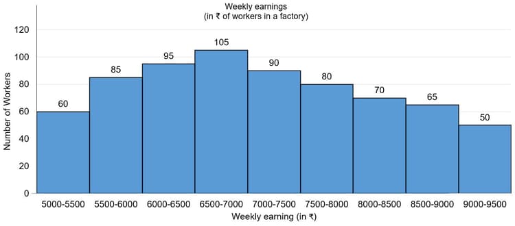
The number of workers in the factory whose weekly earning are or more but less than is:
Represent the following data by histogram:
| Price of sugar (per kg in ) | Number of weeks |
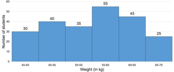
The histogram shows the weights of students of class in a school.
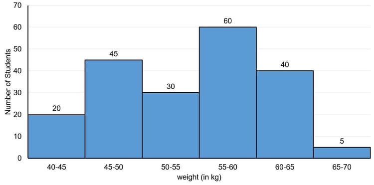
Let be the number of students whose weight is less than and be the number of the students whose weight is greater than or equal to . What is the value of ?
Study the given graph which shows the number of workers with their wages and answer the question that follows:
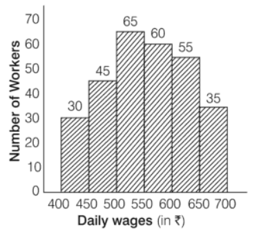 .
.
What is the ratio of the total number of worker whose daily wages are or above but less than to the total number of workers whose daily wages are or above?
Study the given histogram that shows the marks obtained by students in an examination and answer the question that follows.

The number of students who obtained less than marks is what per cent more than the number of students who obtained or more marks? (correct to one decimal place)
The given graph shows the weights of students in a school on a particular day.
The number of students weighing less than is what percent less than the number of students weighing or more?
Study the given histogram that shows the marks obtained by students in an examination and answer the question that follows.
If the total marks obtained by students be represented as a pie chart, then the central angle of the sector representing marks or more but less than , is _____. (Correct to the nearest degree)


