Circle Graph or Pie Chart
Circle Graph or Pie Chart: Overview
In this topic, a circle graph shows the relationship between a whole and its parts. Here, the whole circle is divided into sectors. The size of each sector is proportional to the activity or information it represents.
Important Questions on Circle Graph or Pie Chart
The following pie chart gives you the information about your class. Find the fraction of the circle representing each of the information.
The pie has given information about "Viewers watching different types of channels on T.V'.
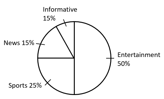
Which two types of programs have the number of viewers equal to those watching sports channels?
The pie given information about viewers watching different types of channels on T.V.

Which type of programmes are viewed most?
The following pie chart gives you the information about your class. Find the fraction of the circle representing each of the information.
The following pie chart gives you the information about your class. Find the fraction of the circle representing each of the information.
The following pie chart gives you the information about your class. Find the fraction of the circle representing each of the information.
Draw a pie chart of the data given below.
Time spent by a child during a day.
- Sleep -
- School -
- Homework -
- Play -
- Others -
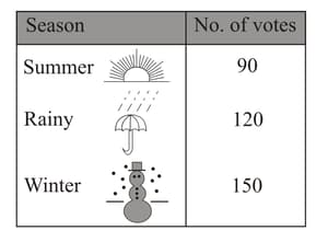
A group of people were asked to vote for their favourite season from the three seasons, rainy, winter and summer.
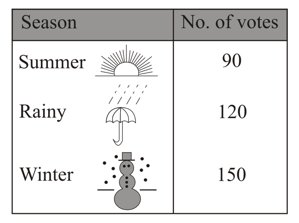
Find the central angle of each sector if you have to represent it in a pie chart?
A survey was made to find the type of music that a certain group of young people liked in a city. The below pie chart shows the findings of this survey.
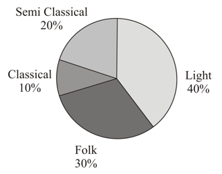
If a cassette company were to make CD’s, how many of each type would they make?
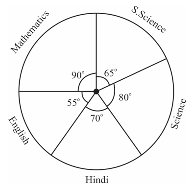
The adjoining pie chart gives the marks scored in an examination by a student in Hindi, English, Mathematics, Social Science and Science. If the total marks obtained by the student is , examine whether the sum of the marks obtained in Social Science and Mathematics is more than that in Science and Hindi.
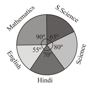
The adjoining pie chart gives the marks scored in an examination by a student in Hindi, English, Mathematics, Social Science and Science. If the total marks obtained by the student is , answer the following question.
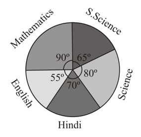
How many more marks were obtained by the student in Mathematics than in Hindi?
The adjoining pie chart gives the marks scored in an examination by a student in Hindi, English, Mathematics, Social Science and Science. If the total marks obtained by the student is . In which subject did the student score marks?
A group of people were asked to vote for their favourite season from the three seasons, rainy, winter and summer.
Draw a pie chart to show this information.
A group of people were asked to vote for their favourite season from the three seasons, rainy, winter and summer.

Which season got the most votes?
A survey was made to find the type of music that a certain group of young people liked in a city. Adjoining pie chart shows the findings of this survey. Which type of music is liked by the maximum number of people: Semi Classical / Folk / Light?
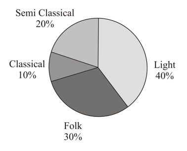
A survey was made to find the type of music that a certain group of young people liked in a city. Adjoining pie chart shows the findings of this survey.
If people liked classical music, how many young people were surveyed?
The number of students in a hostel, speaking different languages is given below. Display the data in a pie chart.
| Language | Hindi | English | Marathi | Tamil | Bengali | Total |
| Number of students |
Draw a pie chart showing the following information. The table shows the colours preferred by a group of people.
| Colours | Number of people |
| Blue | |
| Green | |
| Red | |
| Yellow | |
| Total |


