
Collection and Presentation of Data
Collection and Presentation of Data: Overview
This topic covers concepts, such as, Presentation of Data, Raw Data, Primary Data & Secondary Data etc.
Important Questions on Collection and Presentation of Data
How do you draw a histogram of varying widths?
Coronavirus disease (COVID) is an infectious disease caused by the SARS-CoV virus.
Most of the people who got infected with this virus have experienced mild to moderate respiratory illness and recovered soon. But, some people have become seriously ill and required medical attention. Older people who have other medical conditions like diabetes, chronic respiratory disease, or cardiovascular disease etc. will be infected easily and develop serious illness. Anyone, at any age, can get sick with Coronavirus and become seriously ill or die.

During a survey, the ages of patients who are infected and admitted in a city hospital are recorded. The data is represented using the histogram as show below:

The class width of the given data is
Coronavirus disease (COVID) is an infectious disease caused by the SARS-CoV virus.
Most of the people who got infected with this virus have experienced mild to moderate respiratory illness and recovered soon. But, some people have become seriously ill and required medical attention. Older people who have other medical conditions like diabetes, chronic respiratory disease, or cardiovascular disease etc. will be infected easily and develop serious illness. Anyone, at any age, can get sick with Coronavirus and become seriously ill or die.

During a survey, the ages of patients who are infected and admitted in a city hospital are recorded. The data is represented using the histogram as show below:
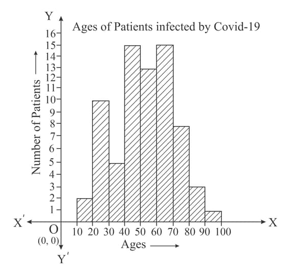
The age group of the highest number of patients infected by Covid is
The graphical representation of the time series is known as:
Consider the following Histogram:
There is a 'Kink' before the class interval on the horizontal axis. What does it mean?
Consider the following Histogram:
There is a 'Kink' before the class interval on the horizontal axis. What does it mean?
Draw the frequency polygon for the following data
| Class Interval | 10-20 | 20-30 | 30-40 | 40-50 | 50-60 | 60-70 | 70-80 | 80-90 |
| Frequency | 4 | 6 | 8 | 10 | 12 | 14 | 7 | 5 |
The length of the rectangle of histogram and the frequency are proportional to each other.
Frequency polygon is drawn after drawing the histogram of the collected data.
To draw frequency polygon we need to draw histogram first.
Frequency polygons can also be drawn independently without drawing histograms.
"Information of attendance of every student collected by visiting every class in a school" is _____ data. (primary/secondary)
Secondary data is the data collected by the experimenter himself.
Classify the following information as primary or secondary.
The information of heights of students was gathered from school records and sent to the head office, as it was to be sent urgently.
children were asked about the number of hours they watched TV in the previous week, their responses were:
What is the class mark of class?
The heights of a group of people is recorded in inclusive classes:
|
Class Interval (Height in Centimetre) |
Total | ||||
| Frequency |
Which class has the highest frequency?
children were asked about the number of hours they watched TV in the previous week, their responses were:
How many children watched television for or more hours in the week?
Observe the above frequency polygon and find the class-mark of the class having frequency of students.
Percentage of number of accidents and number of deaths in accidents is shown in the graph below.
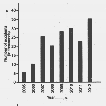
Find the difference in number of accidents in .
Percentage of number of accidents and number of deaths in accidents is shown in the graph below.

In which year, number of deaths are minimum.


